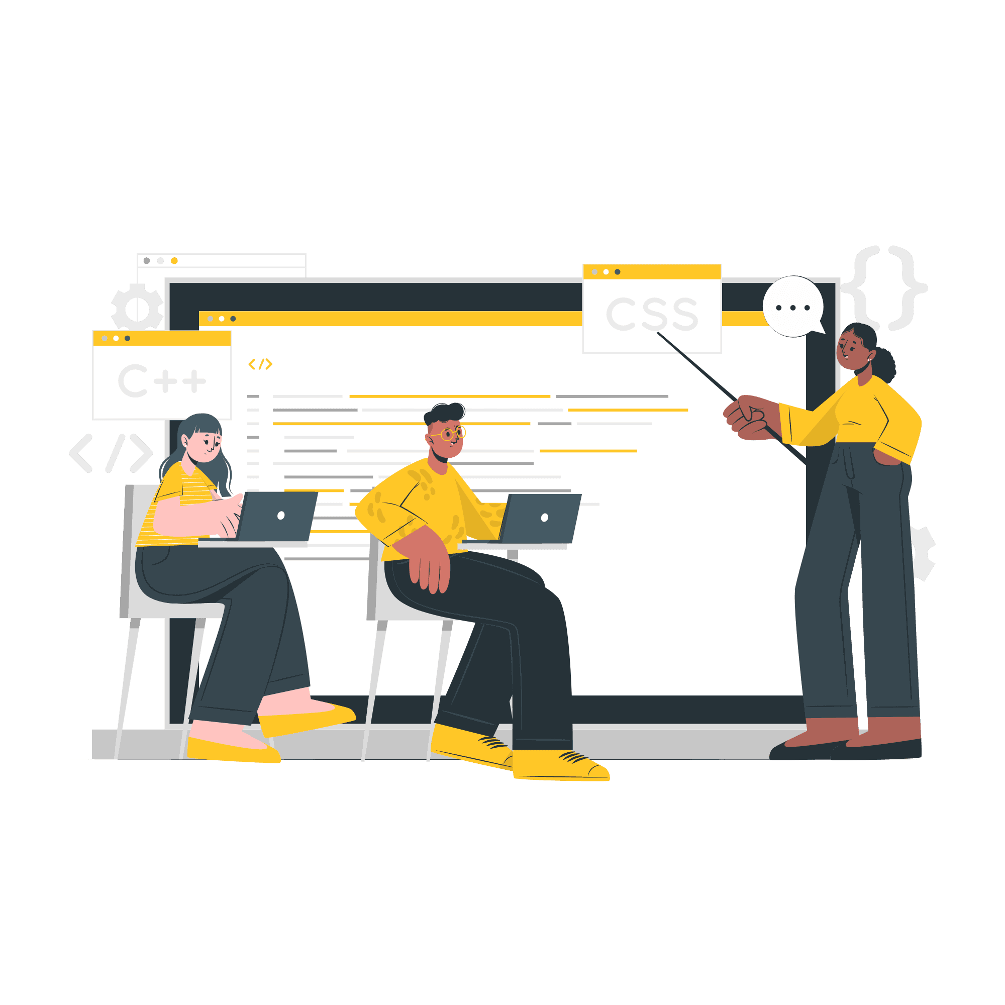
Baby steps: HTML to Flexbox and More - Learning and Growth

Transitioning from the oil and gas industry to the world of software Engineering. The idea of utilizing web facing technologies to tackle real-world problems excites me! This platform will be my creative outlet for documenting this journey.
Hello everyone, and welcome to my very first blog post! I'm not sure if anyone will actually read this, but I want to express my gratitude for being here and joining me on this adventure. Let's dive right into today's topic: "My inaugural blog post!"
Baby steps
Over the past few weeks, I've been contemplating the type of content to create. Initially, I had grand ambitions of becoming an educational guru, but reality quickly reminded me that I still have much to learn! Balancing the act of learning and teaching simultaneously is quite challenging, so I might tackle that when I've gained more experience.
So, what's the plan now? I've decided to focus on the path of self-discovery. My goal is to document my learning journey, share my projects, reveal the challenges I've encountered while learning and building, and most importantly, discuss how I overcame those challenges. This decision has become clear to me over the past few weeks, although I'm not entirely certain if it's the right approach, it's the path I'm most passionate about right now.
Humble beginnings
My coding journey began back in September of last year, but life threw some unexpected obstacles my way and I had to put my plans on hold after a few weeks of learning HTML and Basic CSS. I tried again at the beginning of the year, and I found myself relearning HTML and CSS after a hiatus. It wasn't without its challenges, but I was determined. However, life intervened once again as my full-time job demanded my attention, and coding had to take a back seat for the second time. Despite the frustration, I refused to give up.
Then came my "Eureka!" moment. Before diving back into coding, I decided to equip myself with the right tools. I researched effective study methods, created a study schedule, devised a roadmap, selected my study resources (shout out to freecodecamp.org and Colt Steele's Web Dev Bootcamp on Udemy!), and established a distraction-free study environment. Around mid July, 2023, I officially resumed my journey.
Starting HTML
I began with a fresh start, learning the basics of HTML and its document structure. Gradually, I explored lists, forms, and input elements, delving into HTML validation and the significance of semantic HTML and accessibility. It was eye-opening to consider how people with disabilities navigate the web. To solidify my knowledge, I spent several days building projects, even if they looked a bit rough around the edges(they lacked the flair of CSS).
Exploring CSS
With practice under my belt, I ventured into the colourful world of CSS. My excitement knew no bounds as I discovered selectors, properties, and values. Selectors like descendant, direct child, adjacent, and attribute selectors opened up new possibilities. Basic CSS properties like colour, background colour, width, height, font size, and font-weight became my playground.
I continued my journey into the realm of CSS, exploring colour theory(e.g, rgb, hsl, hexcodes and colour names), the alpha channel and colour gradients(e.g, linear, radial and repeating gradients). Mastering how and when to use classes, pseudo-class, pseudo-element, and IDs. How Specificity and the cascade worked, and I even learned how to use the powerful ! important keyword. Next, it was time to unravel block and inline elements, along with the box model in relation to element on the webpage, the elements margins, its padding and its borders. How to and when to use CSS units like rems(for fonts-size), ems(for margins, paddings), percentages(for relative lengths and widths), and pixels(for fixed lengths, width, and borders) after plenty of research and experimentation.
My journey briefly paused as I built a tribute page to Nikola Tesla and a marathon registration site(check it out here)—now with a more polished form! I even implemented responsive design techniques (yes, I finally tackled responsiveness!).
Flexbox
Flexbox became my next challenge, and it significantly improved my layout skills. it was here I got introduced to a powerful CSS property called the display property. With just a few lines of CSS, I could manipulate layouts. I delved into properties like justify-content and align-items, mastering the art of positioning elements both horizontally and vertically with ease. Flexbox opened up a world of possibilities, and I let my creativity flow, even creating a cat app gallery project.
The Position Property
I also learned how to use the position property and its associated values to manipulate the positioning of elements on a webpage. For instance, applying the absolute value to an element takes it out of the normal flow of the webpage and positions it relative to its closest positioned ancestor. If there is no positioned ancestor, it's positioned relative to the root element, which is<html>.
eg
 .card{
    position: absolute; /*this element is has it position value set to absolute */
    top: 20px;
    left: 30px;
}
I discovered that elements with their position property set to relative are positioned relative to their position on the webpage but do not break away from the normal flow of the document. I also explored other position property values such as fixed, static (default value), and sticky, and learned how positioned elements behave within their stacking context when the z-index property is applied to them.
The power of CSS Transforms
Additionally, I delved into the transformative power of the transform property, which is incredibly versatile. It allows us to resize elements using the scale() function, position elements using the translate() function, skew elements using the skew() function, and rotate elements using the rotate() function as values for the transform property.
eg
 .card{
    width: 200px;
    height: 300px;
    transform: translate(-24px, 10px); /*this element will be moved 24 pixels to the left and 10 pixel from the top*/
}
Media Queries
I tackled responsive design by delving into CSS media queries and adopting the mobile-first design methodology. CSS media queries are incredibly handy tools that enable us to create style rules tailored to specific devices and screen sizes, allowing us to craft webpages that adapt based on the viewing device.
Now, the mobile-first approach, as the name suggests, encourages us to prioritize designing for mobile devices initially. This makes sense because mobile layouts are generally simpler, focusing primarily on one-dimensional displays. Then, we use different media queries to write relatively concise CSS for devices with larger screens.
A media query consists of three key components:
The Media Type (e.g., screen, print, speech): This specifies the type of media to which the styles apply.
Media Query Logical Operators (e.g., AND, NOT, ONLY): These operators help refine the conditions for applying styles.
Media Feature (e.g., width, height, max-width, max-height, orientation - landscape or portrait, resolution, etc.): This defines the specific criteria or characteristics of the target device or screen.
eg
@media screen and (max-width: 619px) {
  .main {
    width: 90%;
    margin: 0 auto; /* for screens not larger than 619px, apply these style rules */
  }
}
CSS Variables
Another exciting topic I explored was CSS variables. I found that declaring these variables in the :root pseudo-class enables the creation of reusable styles. This means that making changes to these variables cascades those changes throughout the stylesheet, reducing the amount of code that needs to be written and minimizing the chances of errors.
eg
/*Variable for the primary color, secondary color and
the Primary font-size have been declared within the root element using the `root` pseudo class*/
 :root{
    --primary-color: red;
    --primary-color: rgb(255, 255, 255);
    --primary-font-size: 62.50%;
}
.main{ /*variables ar used within other styles by using the like this*/
    background-color: var(--primary-color);
    font-size: var(--primary-font-size);
}
My Projects so far...
HUB CAFE
I created a website for a cafe called Hub Cafe, using Flexbox to structure headers, sections, and footers. Linear gradients added visual flair, and I fine-tuned responsiveness with min-width and max-width properties. The journey had its share of bumps, especially when it came to perfecting the display of images and logos, but I learned valuable lessons along the way.
Screenshots and links

FinBase
My most recent project, a website for a fictional fintech company called "FinBase", pushed me out of my comfort zone. It was a rollercoaster ride filled with patience, breaks, and extensive Googling. I learned that understanding the "why" behind things is crucial and that it's okay not to have all the answers immediately. It was a journey of self-discovery as much as it was about coding.
Fun fact: While working on this project, I encountered my first merge conflict and successfully resolved it through some diligent Googling.
Screenshots and links

Some Skills I picked up
In the course of building these projects, I made the switch from using GUI tools in VSCode for Git to getting comfortable with the command line interface (CLI) in the terminal. This shift really helped me grasp Git's ins and outs and made my workflow smoother. Plus, I also got the hang of Markdown, which turned out to be a fantastic tool for conveying the functionalities of each project on GitHub. It's a wonderful tool for creating clear and organized documentation that makes everything more user-friendly!
In Conclusion
As I conclude this post, I want to emphasize one thing: consistency pays off. Looking back, I've come a long way from where I started just a few weeks ago. While I know there's a vast world of coding knowledge waiting for me, I'm proud of the progress I've made so far. This motivates me to keep moving forward, knowing that the future holds even more exciting challenges and discoveries.
Thank you for staying with me this far; you're amazing! Please consider following my blog, as I promise to share my journey regularly. And guess what? I'll be back soon with an update on my fourth project, a Twitter clone. I can't wait to share all the details with you. Until next time, stay positive and keep coding!